Hero banner for the Mercell article.

The next generation website and app for suppliers looking for business opportunities

Figma prototype ↑

Mercell is modernizing their services. The goal is to reduce the amount of legacy platforms and build new ones with focus on UX from the beginning. For the last year or so, I have been working for on Mercell's next generation SaaS platform that focuses on self-service and scalability to new markets. In this article, I will focus on the the main project I've been working on, which is to funnel free users to becoming paying customers.

Year

2021—2023

My title

UX Designer

Tools

Figma, Miro, Jira, Amplitude, Photoshop, Illustrator

Ways of working

Agile sprints

Usertests

Internal-, stakeholder- and user interviews, A/B testing, usability testing

Team and domains

My team consists of a project manager, tech lead and developers. We work domain-based, and our domains are authentication, authorization, online sales and distribution & presentation. As the designated UX designer in the team, my main mandate lies with the user.

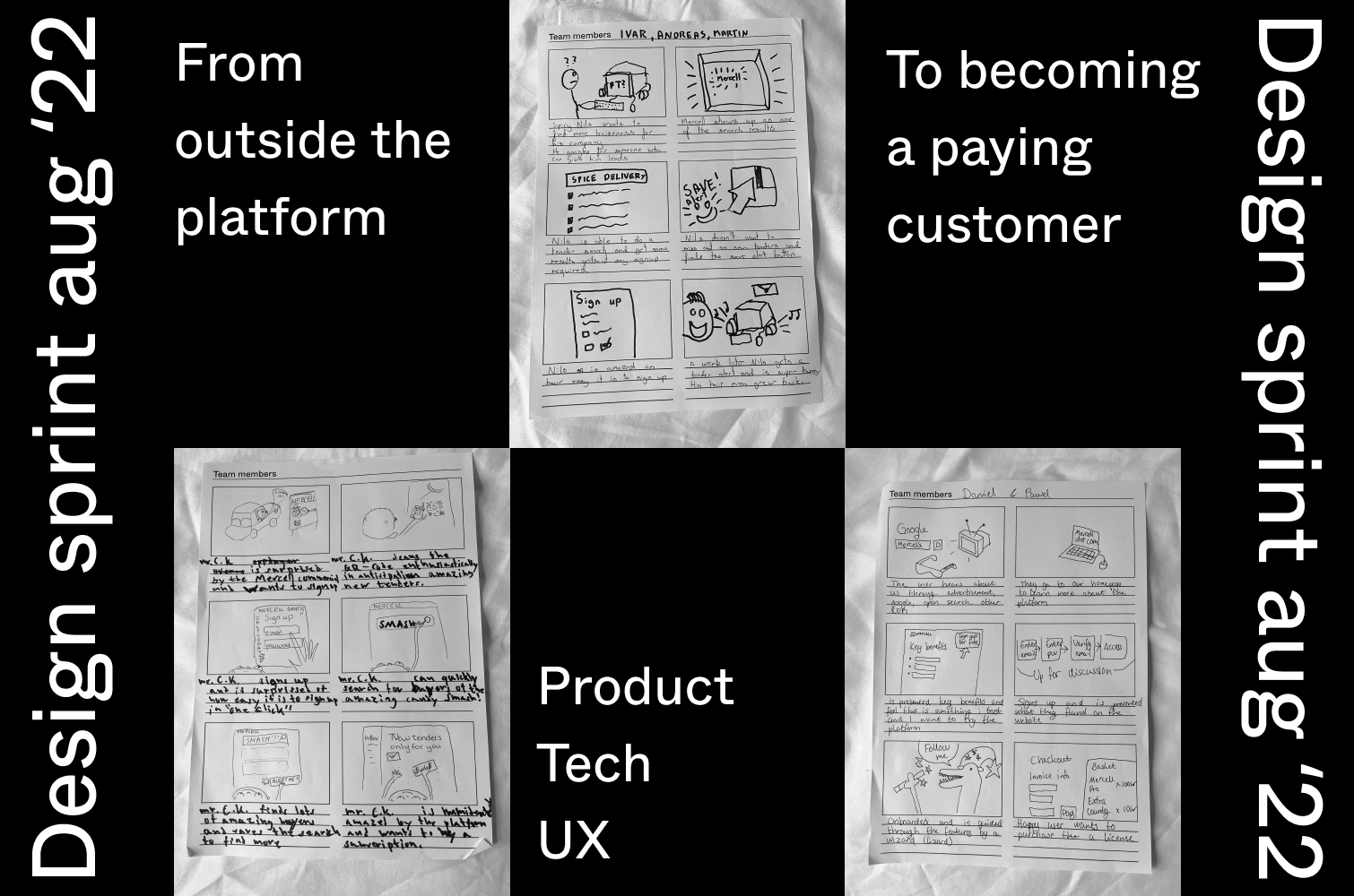
In the project I'm presenting, my work consists of mapping and designing the user journey from unknown visitor to paying customer. Here I work with a meaningful and rewarding website, a frictionless signup, a good first impression through a trial of the service and an intuitive checkout for purchasing subscriptions, add-ons and products.

Userbase

For over 20 years, Mercell has accumulated their customer base, and at this point it mainly consists of experienced users who know the system inside and out. Some users have been members for several years, and their general opinion is that they know their way in the system, and see no need for radical changes.

But a new generation of users are well on their way. They expect to be able to do more tasks themselves. Such as keeping track of your team members yourself, distributing licenses and roles, and being able to manage your own subscription and add-ons in the service. At this point in time, some might take these features for granted. But as far as we know, this will be available for the first time in the world of e-tendering.

From a business point of view, it also makes sense for Mercell that users should be able to do these tasks themselves. It increases the scalability to new markets where we do not have a established commercial department yet.

Personae and user segments

Segmenting and creating personae for this project was a challenge. As our domains are those that essentially all users have to go through, it made the most sense to divide the user groups into users who want to do things themselves, and users who want us to solve tasks for them. For that reason, two personas were prepared based on user research: Gitte and Henrik.

Gitte has worked with public procurement for some years, and is quite used to how things work. She perfers assistance to do most, if not all tasks herself.

Henrik is relatively new to public procurement, so he has not much history with how Mercell. He is used to perform tasks self-service from other services he uses.

Roles

In our user journey, the user can have different roles at different stages. The goal is to funnel them to the next role, for them to end up as a paying customer.

Mapping user roles and touch points.

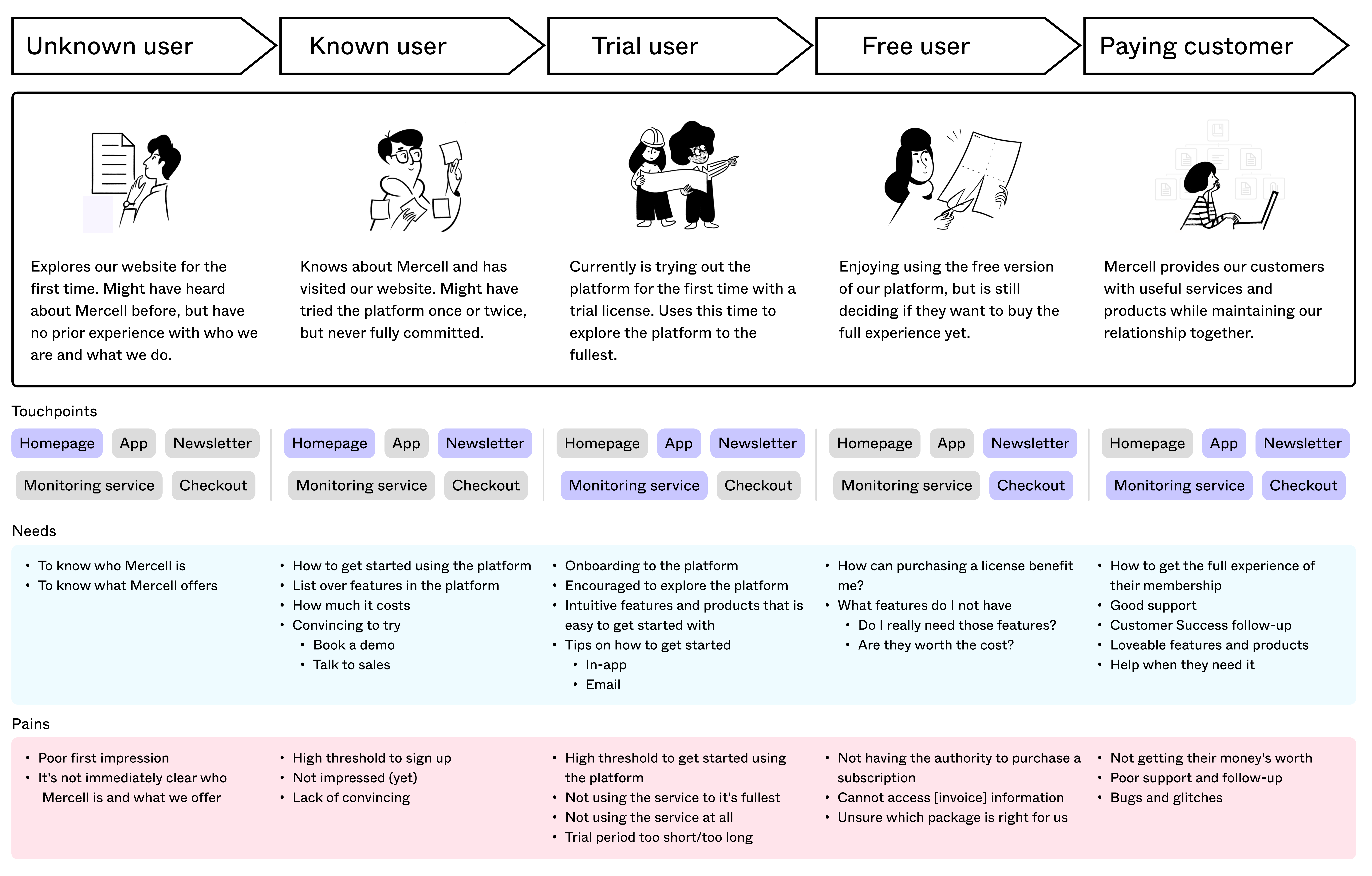
In order for them to complete the journey, the challenge is to remove friction and make it satisfactory, but at the same time ensure that their needs are taken care of. The user must also understand the value of moving on, and want it. Otherwise, we risk them dropping out, going to competitors, giving up, ...

Based on where in the journey the user is, it must be clearly communicated what the next step entails, and how to get there. This can be done through information architecture with intuitive steps that that makes sense for the user.

Mapping the user journey

Mapping of the user journey done in Miro.

Building the website

At this point, we had our personas and roles established, user journey mapped, needs, pains and ideas made tangible. For the website, we know that it needs to:
— Explain who we are and what we do
— Feature open search
— Show off the app and USP's
— Feature and pricelist
— Intuitive sign up (for trial)
— Contact sales

Open search is the first thing the user see, as we expect it to be the primary action. However, an explanation of who Mercell is and what we do is in the view as well. A/B testing will determine the prioritization.
Who we are and what we do, features and contact sales is available in the menu, which is also a failsafe.
Unique selling points.
Package display with online checkout for the Henrik personae.
Contact sales to appeal to the Gitte personae.
Quantitative research: Open search can be used to collect a broader feedback about our core service.
Business opportunity page for organisations that has purchased an upsell product that increased visibility.
Intuitive signup to remove frictions discovered in our legacy platforms. Insight has shown that ~80% of users drop off in the legacy platform for various reasons that are now removed.

Data collection

This website has yet to go live as we are prioritising the app at this point (more info later), so further insight has to be gathered. When this goes live, we are able to use cookies to track user behaviour, primary actions, identify frictions and flaws. We will also be able to further iterate and add more content like newsletter, blog, webinars, FAQ, Help Center, ...

Building the web application

After signing up, the user will receive a 14 day free access to the service, where every feature will be unlocked. The goal is for them to become sticky during this trial period. In this period, we will use Amplitude tracking to identify the best happy paths that makes them stick around, and nudge users in this direction.

We want to guide the user to try out the features they will be using the most. The balance is to make it useful instead of intrusive.
Dual purposes: In-context help center to reduce drop-off rates, and offload customer support.
Reduced drop off rates: In other platform, the signup drop off rate has been up to 80% because you need to provide organisation number. Moving it to the step where it is neccessary, when purchasing a license, can reduce the drop off rate.
Self-service checkout after the trial is over.
Contact sales for users not comfortable with doing online checkout can become high quality lead for the Sales department.
The organisation page functions as the control panel of the app.
Self-service subscription management.
After becoming a subscribing member, we can introduce the user to useful integrations and upsell products.

Prioritization

We are currently prioritising the control panel (profile- and organisation page) and the backoffice, as everyting else is built upon this foundation.

We're currently building the foundation, which is the backoffice and profile/org page.

Key takeaways

This is an ongoing project where we work in 2 week sprints, shipping deliveries iteratively, so we are constantly learning and improving our service.

This platform has yet to be published to newsales, meaning we have a very small userbase. Doing both qualitative and quantitative research that calls for bigger segments has to be compensated for. We're doing internal and external interviews and usertests with users from our legacy platforms, which is not ideal, but still very insightful.

Very much looking forward to gather insight on a bigger scale.