
Design Sprint workshop
We initiated this project with a design sprint that lasted the whole first week. We did the classic design sprint invented by John Zeratsky and Braden Kowitz from Google before we followed it up with five agile sprints over seven weeks, each lasting one or two weeks.
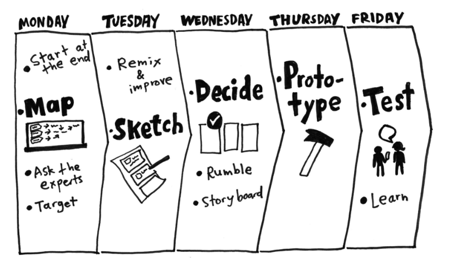
Monday, we did the problem phase. We started by choosing roles like decider and facilitator (me), shot term and long term goals, risk assessment, wrote and conducted an interview for the stakeholders (Vy representatives), and ended the day with How Might We's (HMW).
Tuesday was the day where we made our ideas tangible. We mapped competitors, collected inspiration from similar services, wrote down ideas, crazy 8 and storyboarding.
Wednesday morning, we dot voted on the best ideas from the day before. The ideas that got the most votes was the one we decided to expand further upon.
On Thursday, we made low fidelity wireframes that we could test the next day. We also booked in six people for usabilitytest the day after.
Friday was the final day of the design sprint. This was when we tested the wireframes we made the day before, and figured out which ideas we would spend the next seven weeks on.
Outcome of the design sprint
The outcome of this sprint was that we would iterate on Vy's existing webapplication, as ~60% of their userbase use this platform. At the time, it would only take into account one form of transportation, but we decided to design and code a webapplication that you could book multiple forms of transportation methods in the same journey. We also had ambitions to add extra services, like onboarding to the app, setting up breaks between travel segments and an overview of the journey's environmental impact.
Goal for the project: Create the ultimate door-to-door webapplication.
Working in sprints
The following weeks, we were working in sprints. The developers were reading up upon the API and setting up the React project, while me and the other designers were setting up the Figma prototype. The design system was already provided by Vy, so we read the documentation, gathered the typeface and font sizes, set up the color palette. For icons, we used Font Awesome.
Usabilitytesting
We conducted three rounds of usabilitytesting in this project. Each time with six subjects, but sometimes we had a dropoff. The first round was during the design sprint, as mentioned before. The second was with the prototype after four weeks, our half-way point. The last usability test was performed with the coded solution.
To summarize, we tested the wireframes, high-fidelity prototype and our iteration of the finished solution.
The feedback we gathered during this was very insightful. We used it to constantly steer the direction of what we were building. We got feedback on design flaws, missing features and tips of existing solutions that solved issues we were facing.
Designing the solution
As for the design system, Vy already had an established one. We used their font sizes, colors, buttons etc. We didn't have access to their font, Vy Sans, so we replaced it with Arial.
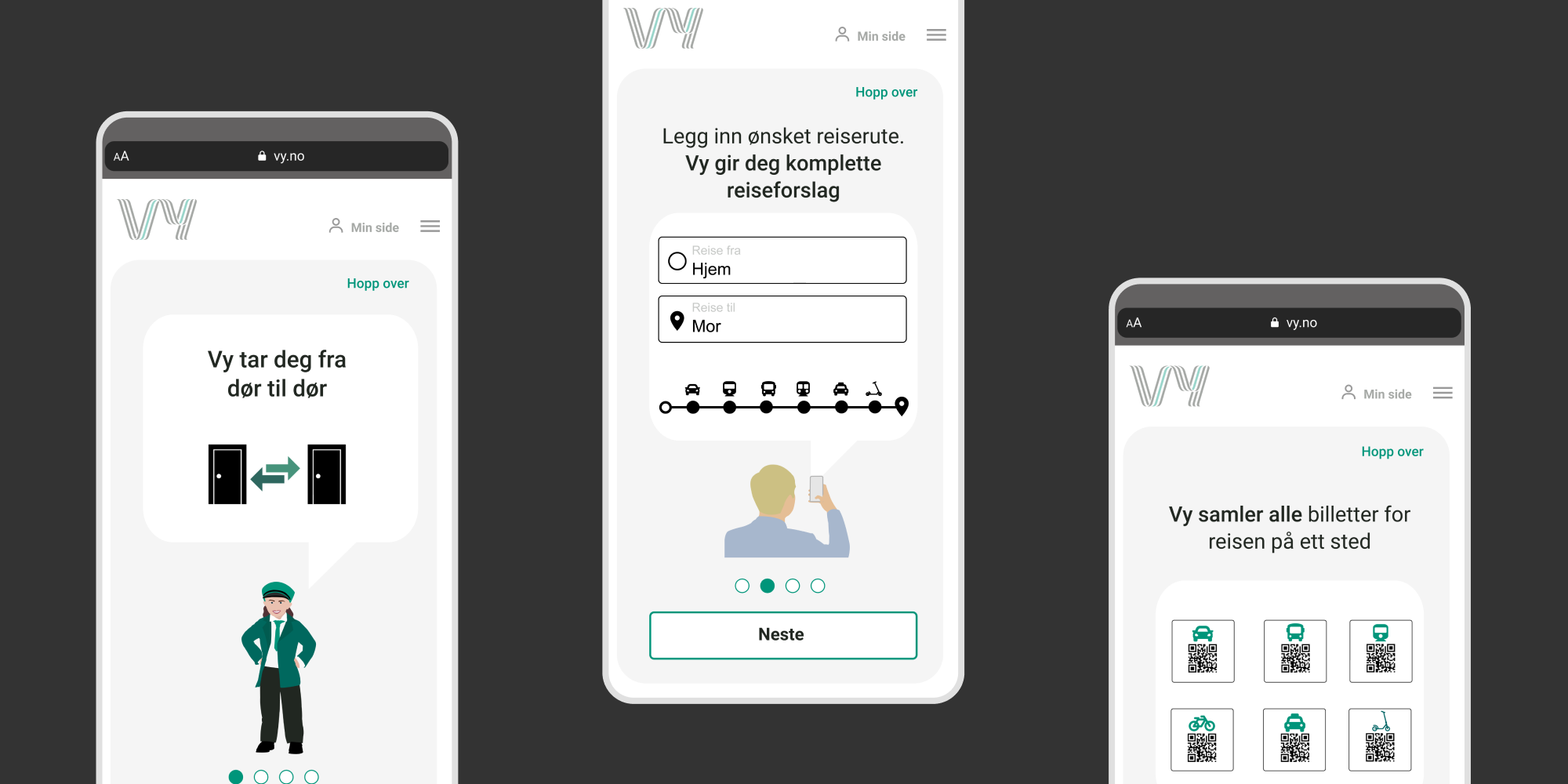
We got some feedback during one of our usabilitytests that there was no way to add a delay in the journey. We noticed a pattern where people wanted to add extra delay in between some stops for different reasons, like grabbing a coffee, relieve some stress etc. So we designed the possibility to do so.

